
Representative Digital Imaging Projects
So, how can you use my digital imaging skills? Create an image of something that doesn't exist yet. Clean up a photo that's less than ideal. Isolate an item or person of interest. Restore an old or damaged photograph. Create graphics to support writing in a document of some type. Combine digital imaging editing with my photography and/or 3D modeling skills - then stand back!
First let me say that I've been using Adobe Photoshop since the first version was released in 1990. It is an insanely powerful, but complex, tool. I have edited or created tens of thousands of images with it for every conceivable use.
One of the most intersting uses is to take a photo of a pre-production or prototype product that may not be completely finished, and "enhance" it, make it "pretty" and suitable for use in sales, marketing, or advertising materials. A very common use along these lines is to simply remove everything that is around the product when it's photographed - especially in a factory environment with lots of distracting stuff around - and isolate the product on a plain background.
As a commercial photographer, I know what photographers have to go through to get acceptable shots. Sometimes, you just have to have supports, clamps, wires, and junk in the photo in order to "get the shot". We then rely heavily on digital image editing to remove all of this extraneous stuff to create the final image.
In each example below, I've provided a large image of the finished composite image, and smaller photos of the "component" images or steps in the editing process showing how we got to the finished image.
Digital Imaging Example: Advanced Product Prototype-to-Press Release Support Image
|
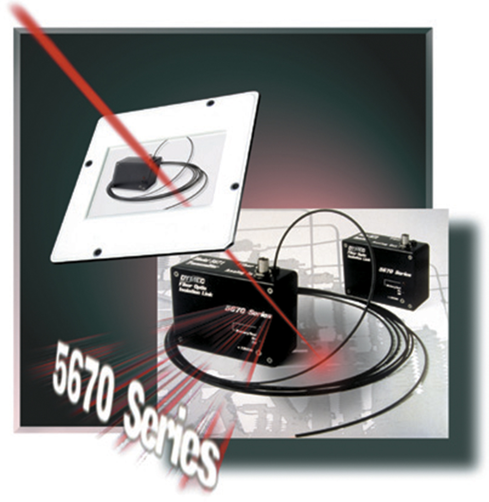
Back before the law of gravity was passed or the invention of digital cameras, we shot 35mm color slides, scanned them, and then manipulated the digital image file. This is an example of a prototype product, shot before final (silk-screen) labeling, enhanced and combined with a background image of a typical application to produce a photo to support a press release package. |
In this particular case, this was long enough ago that I don't have the step-by-step files available - it's actually one of the first images I did. I think you'll get the idea anyway. The actual PR photo did not include the slide image; what's shown here is a composite I put together to illustrate what could be done, even "back in the day." |
|
Top of Page
Digital Imaging Example: Product "Completion"
|
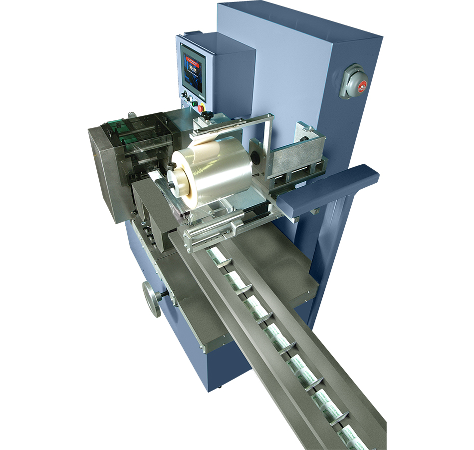
My packaging equipment manufacturer client got jammed up, needing a product photo for a dropped-in-his-lap advertising opportunity, but there was one small problem - the machine wasn't finished yet! In a panic, he asked if there was something I could do (they ALWAYS seemed to be asking that particular question...) |
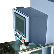
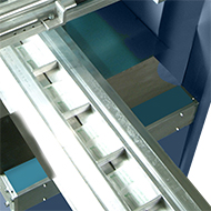
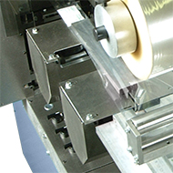
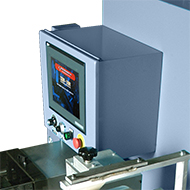
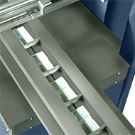
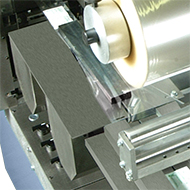
I took the "before" shot on the manufacturing floor, isolated the machine from the junk that surrounded it, and then learned how to "make" stainless steel panels in Photoshop. As you can see, there are multiple panels, and a display screen shot added as well. |
|
 |
 |
 |
|
Addition of display screen |
Conveyor belt completion |
Sealing fin wheel cover |
 |
 |
 |
Top of Page
Digital Imaging Example: Product "cutaway"
|
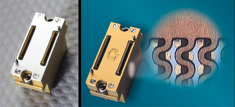
This is a contactor component in a high-dollar piece of electronic test equipment. It's used to make multiple electrical contacts between the test equipment and a large circuit board fixture carrying many similar devices to be tested at the same time under computer control. We couldn't use |
a hacksaw to cut one up to show it's internal structure, which has a special arrangement for highly reliable connections. So, it's done graphically. While we were at it, the final part is gold-plated, and would have the Company logo embossed on it as well. |
|
Top of Page
Digital Imaging Example: Engineering Change
|
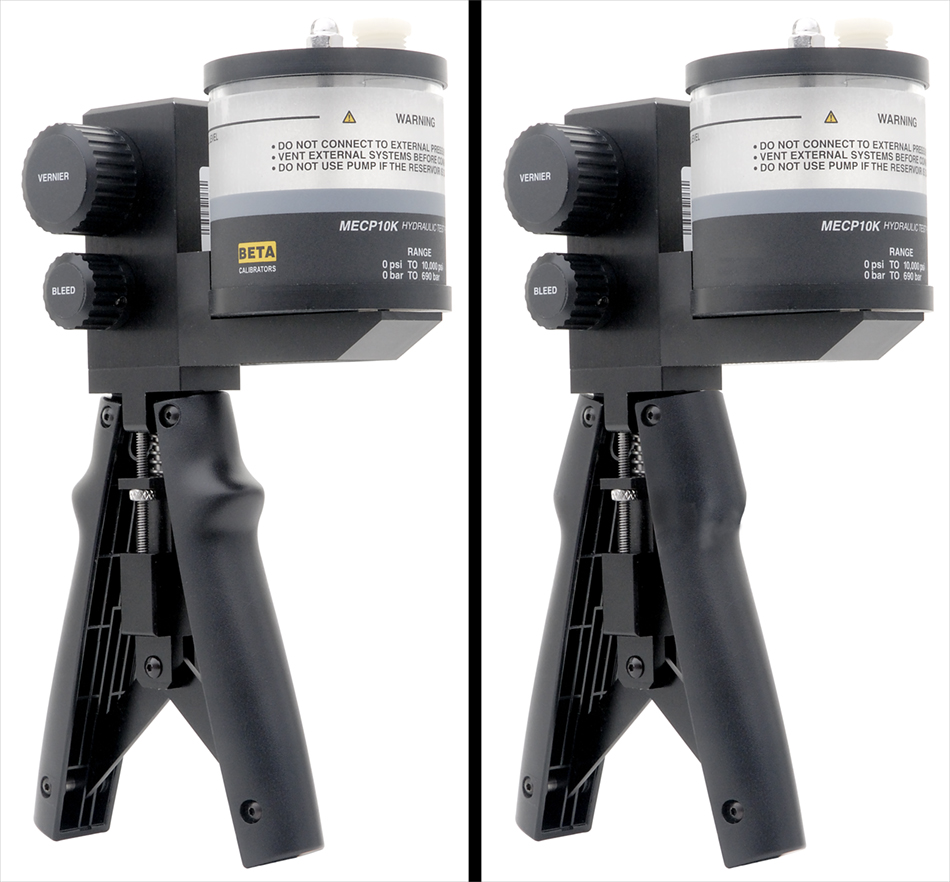
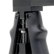
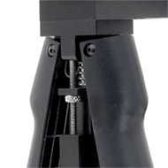
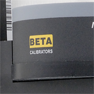
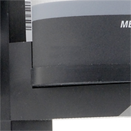
This is an example of when the physical design of a prototpye product is changed prior to final production. Marketing and sales must march on, regardless. So, the client asked that I photograph the prototype and, using the revised engineering drawings, edit the image to match. They also needed a version of the final image |
without their logo to satsify third-part private labeling contracts. To blow my own horn sufficiently here, I should point out that rounded surfaces present their own special editing problems because of the continuously changing lighting on the surfaces. The "before" and "after" reflects both the physical changes and logo removal. |
|
|
|
|
|
Original handle styple |
Actual handle image edits |
New/modified handle |
|
|
|
|
Product with logo in perspective |
Product with logo removed |
Top of Page
Digital Imaging Example: Composite ("Assembled") Image
|
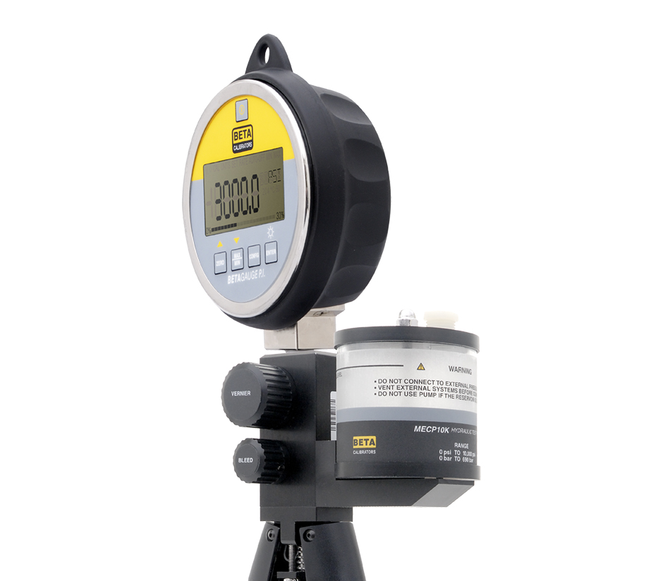
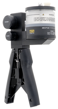
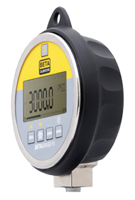
Sometimes a client will want to combine images of two products. The products are often unavailable together at the same time, so, the pieces need to be combined from separate photos. It this example, the two pieces are designed to be integrated together, so the "fit" has to be realistic, and look like they were shot assembled. To add to the interest, one of the pieces is an |
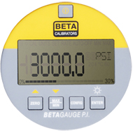
electronic gauge with a digital readout. A lighting setup that is good for the gauge will be terrible for capturing the display, and vice versa. So the two shots need to be done separately and combined. The final image is therefore a composite of three separate shots - the gauge, the display, and the hand pump. |
|
|
|
|
|
Hand pressure pump alone |
Pressure Indicator instrument alone |
Instrument face/display alone |
Top of Page
Digital Imaging Example: Artwork for Published Document Cover
|
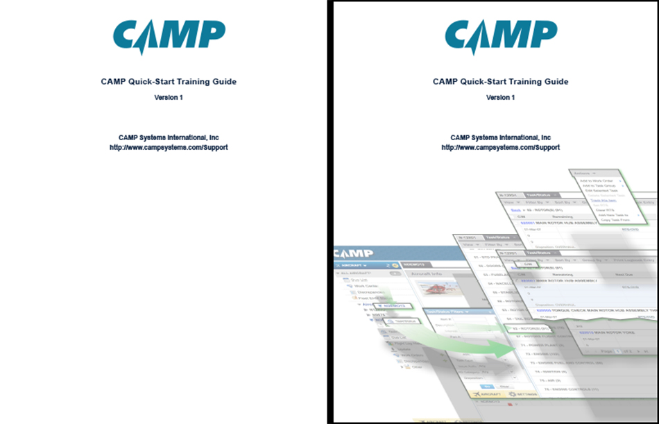
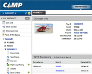
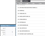
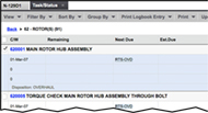
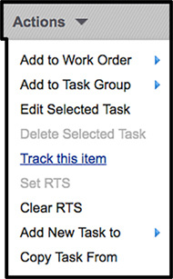
The cover of this Quick-Start User Guide needed something. The contents features screenshots from the web-based aircraft maintenance system as it is described. The screenshots are enhanced with graphical elements and treatments to aid in a quick |
grasp of what is happening as various on-screen control items are clicked. The elements were used to create some interest on the cover, and provide a subtle introduction to the user as to what they would find within the document. |
|
|
|
|
|
Base page screen capture |
Window screen capture layer |
Second window screen capture layer |
|

|
|
|
Drop-down menu screen capture |
Arrow design element |
Top of Page
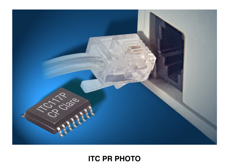
Digital Imaging Example: Press Release Photo
|
This example combines a number of my skills - photography of both the telephone cord end/plug and the telephone port on the equipment, a 3D model of the IC |
that is the subject of the press release, and some image editing to combine the elements to create the final image. |
|
Top of Page